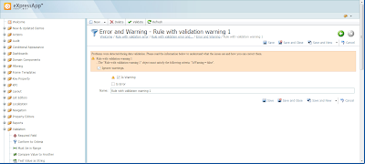
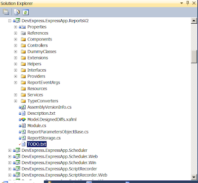
When something gets very complex and there is no space for all the info on the screen (imagine a form with 300 text boxes and other controls on it - yes, I saw such forms in my life!) you can use various techniques to temporarily hide or completely remove certain info (probably rarely used) or allocate it in a way it will occupy less space.
Many container UI elements like tab controls, panels and our
layout control are designed to help you with this task. Talking about XAF apps, the most popular way of accomplishing this I saw was putting unwanted fields behind the
tab groups, which were activated by end-users on demand:
This approach does not involve any refactoring of your underlying data model, but just means re-layouting the default form in a way where most often used data appears on top while having less popular data hidden. It seems that this all comes from trying to mimic the behavior and look & feel of legacy apps or even papers, because many end-users might be accustomed to such a UI in the past.
Another, but less popular approach I saw was in refactoring a huge data model, which technically means aggregating similar data into a separate part, adding a reference to it from the main object and then showing a
separate detail form on demand, e.g. via a button in the toolbar. A perfect example of this can be our
ObjectPropertyEditor that can be used for an aggregated reference property and that displays a nice UI for editing its details:
Today, I would like to show you an alternative way of solving the problem of complex detail forms usability. I am double excited about this solution, because it comes from our XAF customer,
Sergey Zaycev and his team from Galaktika, whom I recently blogged about.
These guys implemented a
custom Property Editor -
TabbedDetailPropertyEditor (
check this help link to learn more on how it is possible to create such extensions yourself), which is essentially a tree-like navigation panel at the left side and a detail panel on the right. Each node in the tree represents a small portion of data, which is then displayed on the right side as user focuses it in the tree:
This hierarchy is fully
customizable at runtime, thus allows you to meet the needs of a very demanding client right in front of his/her PC.
In my opinion, this is a very good alternative to the standard approaches described above. If you think about it, you may find the analogy with how the main application navigation works. Of course, this displaying a small portion of data at a time also works faster and thus is more usable.
I liked this idea very much, what about you?
If you liked this stuff, then I suggest you learn more on it as well as check out other
XAFARI platform features at
http://xafari.ru/


